

WHAT:
This project is a complete rebrand of the (currently struggling) fast food chain Long John Silver's. My goal for this rebrand was to ultimately reposition them from unpopular and outdated to relevant and unique through unique illustrated graphics and merchandise.
WHY:
Arvo was chosen for the body copy because of its fun, nautical flare. Century Gothic was chosen for headers and subheaders because of its contrast against Arvo. Only using it in lowercase was a stylistic choice referencing the way a lot of younger people choose to type exclusively in lowercase for its friendly tone. I also include handwritten comments interspersed throughout the branding that respond to doodles and illustrations of the same line quality.
Color-wise, I shifted the hues of each color to become more red than green and increased the saturation. This pushes the illusion of healthiness as it mimics the colors of the insides of freshly caught fish. I also added a lighter blue color for more background options.

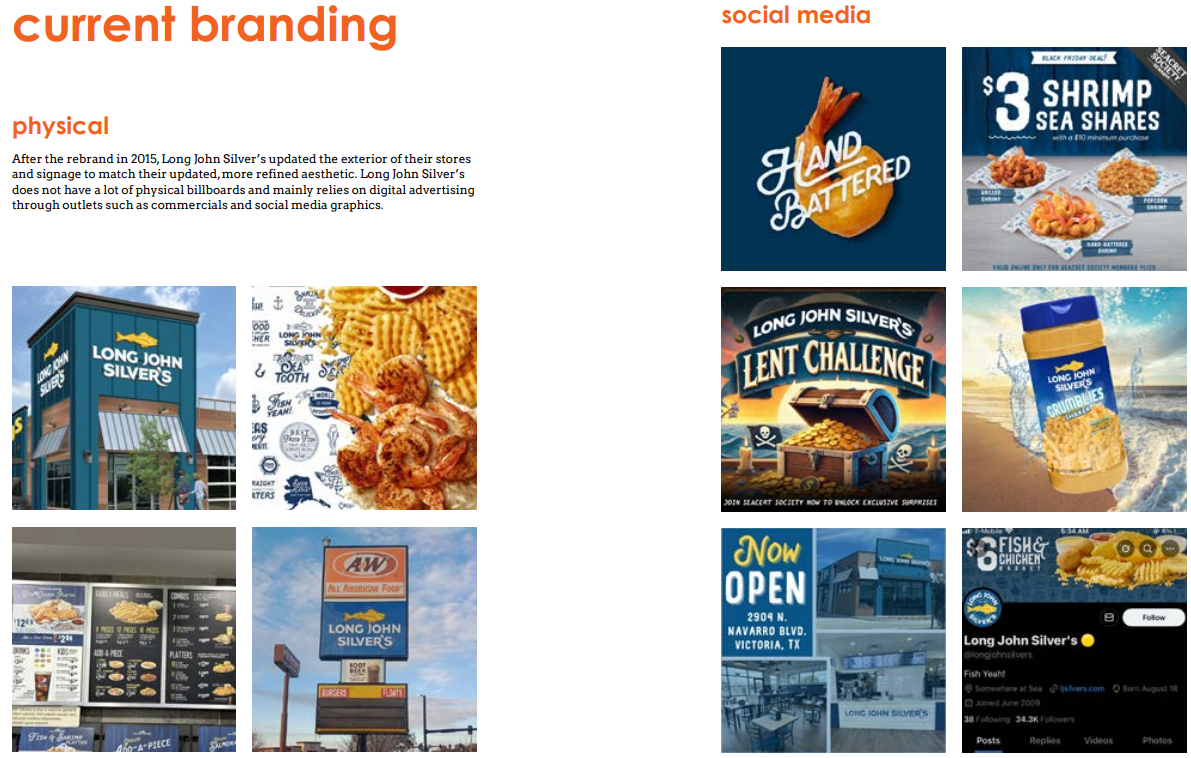
Long John Silver's current social media branding is a lot more playful and experimental than their other advertising methods. Examples of this are their AI generated Lent Challenge graphic, April Fools Crumbles Shaker product mockup, as well as the frequent pun usage in their captions.
They blend these in with their regular branding to deliver a mix of engaging and promotional content.
I looked into Long John Silver's current, adjacent, and aspirational competitors and plotted them on this brand positioning matrix. Long John Silver’s biggest competitor is Captain D’s, as they position themselves similarly as fast-food restaurants specializing in seafood. Other fast-food restaurants with different niches also pose a threat, including Sonic, Culver's, and Raising Canes.
Long John Silver’s adjacent competition consists of sit-down seafood restaurants (Bubba Gump, Red Lobster, Joe's Crab Shack, etc.). They are less threatening than other competitors, as their consumers come for a different experience with a different price-point. Long John Silver’s wants to compete with leading fast-food joints (McDonalds, Taco Bell, Burger King, etc.), but has yet to find a similar level of success.
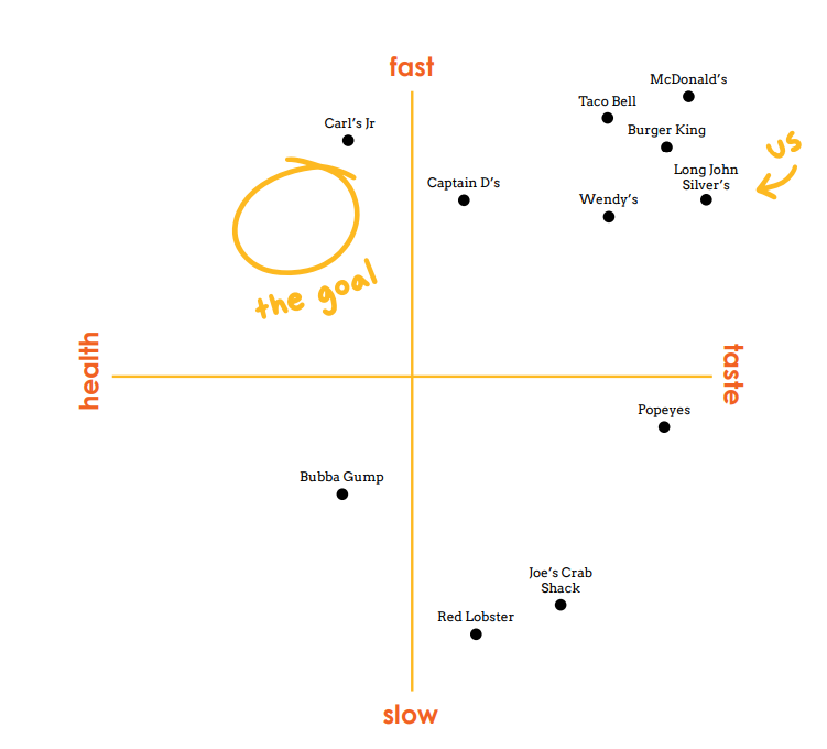

As depicted in this chart, Long John Silver’s seafood-centric menu and pirate theme are strong points of differentiation from other fast food joints, as their unique menu items keep them memorable to consumers. Long John Silver’s has also found past success in partnerships with food and drink brands like A&W and The Cheesecake Factory. Other fast-food chains have found massive success in similar partnerships, like Taco Bell with Doritos and Mountain Dew.
However, Long John Silver’s is not nearly as popular with the youth as other fast-food chains. This is potentially due to changing tastes, as the younger generations avoid unhealthy frozen seafood and strive to eat healthier. Americans also generally tend to prefer burgers to seafood. Their social media presence is unengaging and unpopular, as evident by their accounts across platforms averaging at only about thirty-thousand followers.

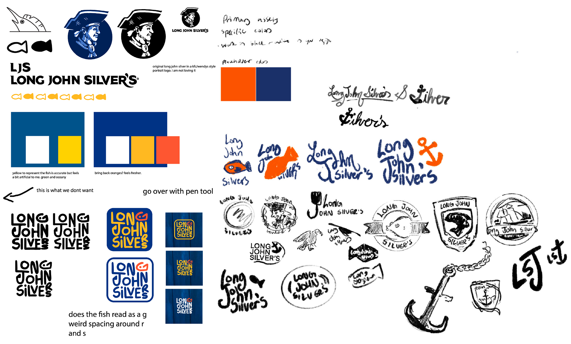
I experimented with a lot of different logo directions and tweaked the color palette until I got it where I wanted it. I wanted to keep the color palette somewhat similar, since the blue and yellow color scheme is so integral to the brand's history and indicative of its nautical theme. I also developed the simplified fish graphic integrated throughout the branding in this stage.

Here are 30 formalized logo drafts, with the most promising directions indicated with a star in the corner. I ultimately went with something very simple as to not distract from the individual illustrations in the branding.

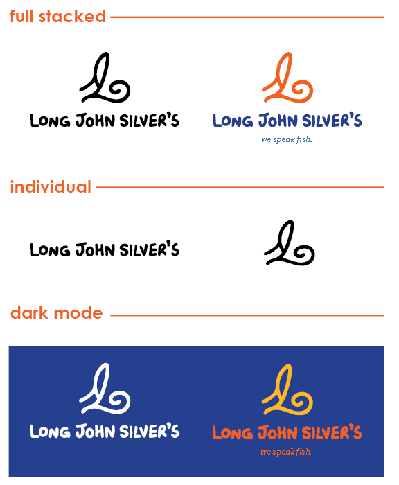
The new logo for Long John Silver's consists of an icon and handlettered typography. The icon is a combination of a cusrive L, J, and S and is positioned to resemble the tail fin silhouette of many different sea creatures. It can be used in a variety of different contexts, including different color options and inclusions.


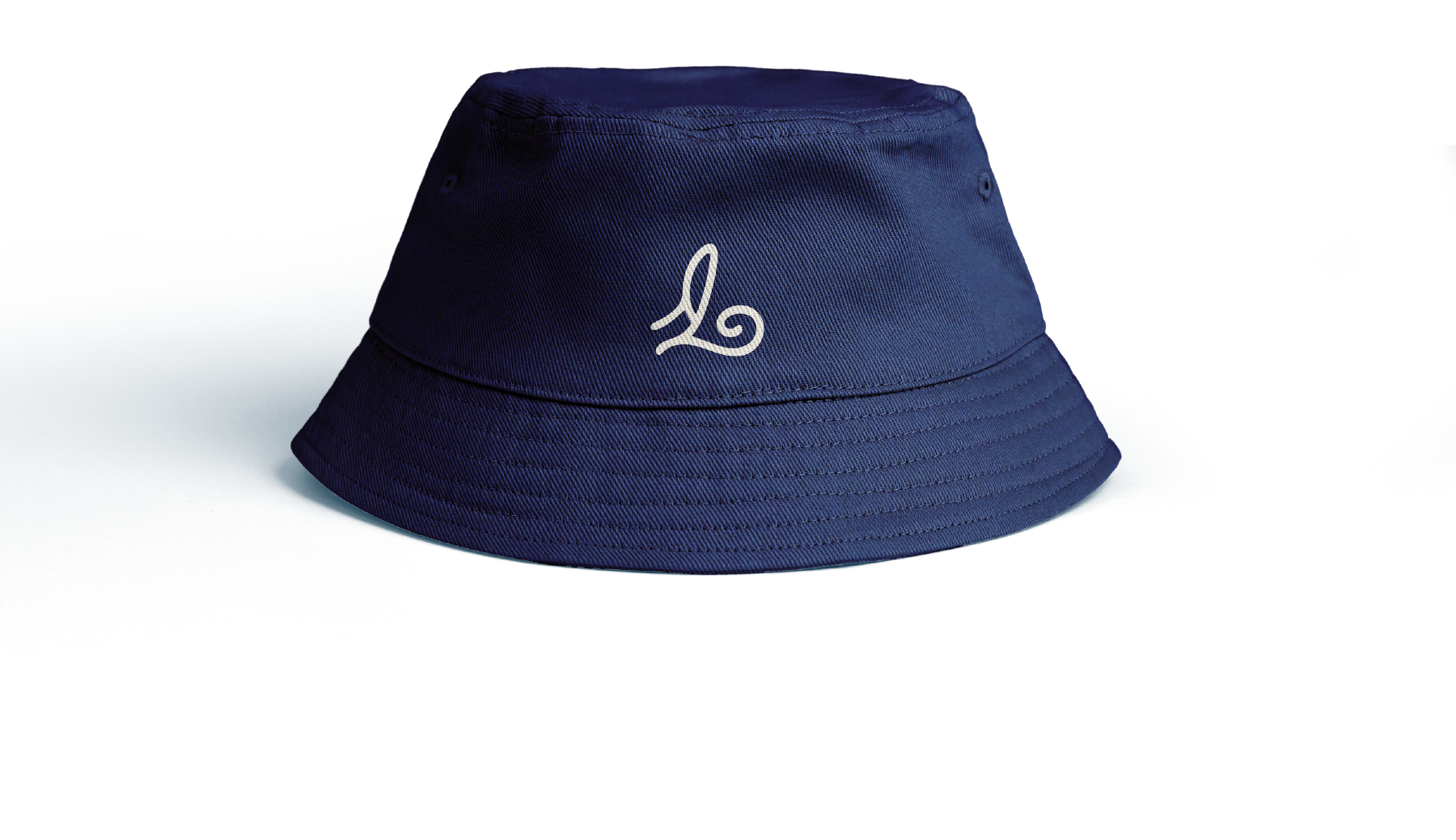
Bucket hats are in-style at the moment and merge the fisherman aesthetic with our young, trendy target audience. Simple and straightforward, this bucket hat features the new Long John Silver’s logo front and center.
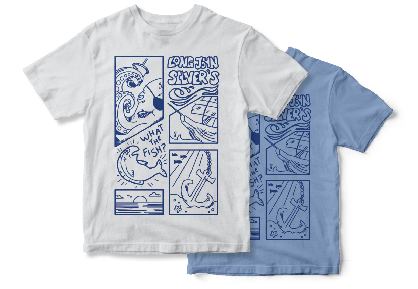
This is a graphic tee developed to extend Long John Silver's rebrand. Blue is a highly wearable color for clothing and represents Long John Silver’s nautical branding at a glance. This linear, comic-inspired style is popular among the youth and the pirate imagery ties in the restaurant’s theme. Oceanic scenes and creatures are interspersed among the panels to suggest the idea of fresh seafood.
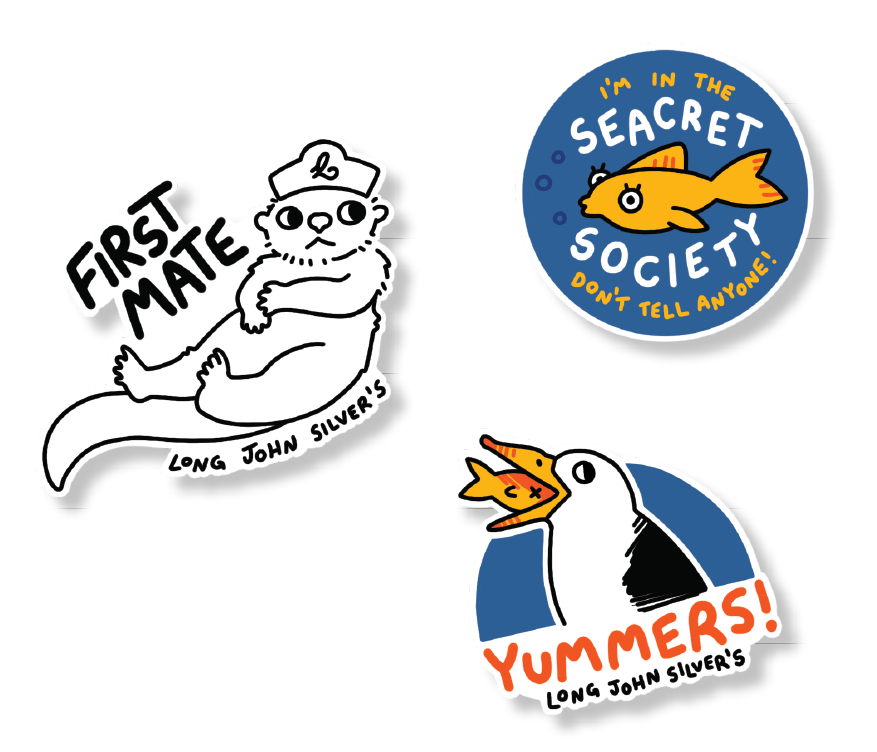
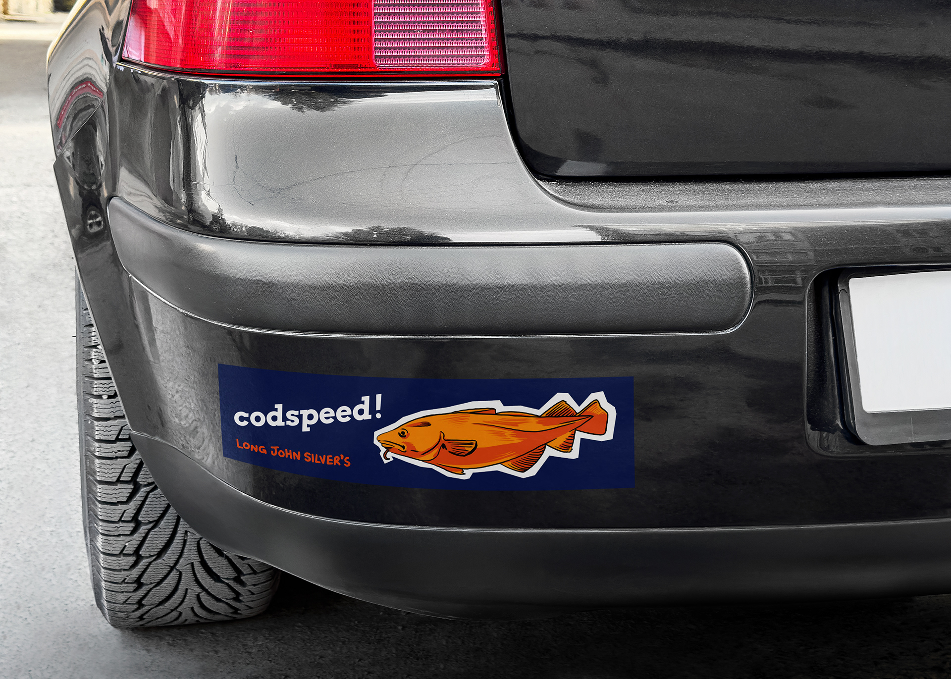
Stickers! The more stylized stickers on the left are targeted towards children to give to them in-store and encourage them to return to Long John Silver's. The bumper stickers are an extension of the branding exclusively targeted to adults, encouraging drivers to stop at Long John Silver's.

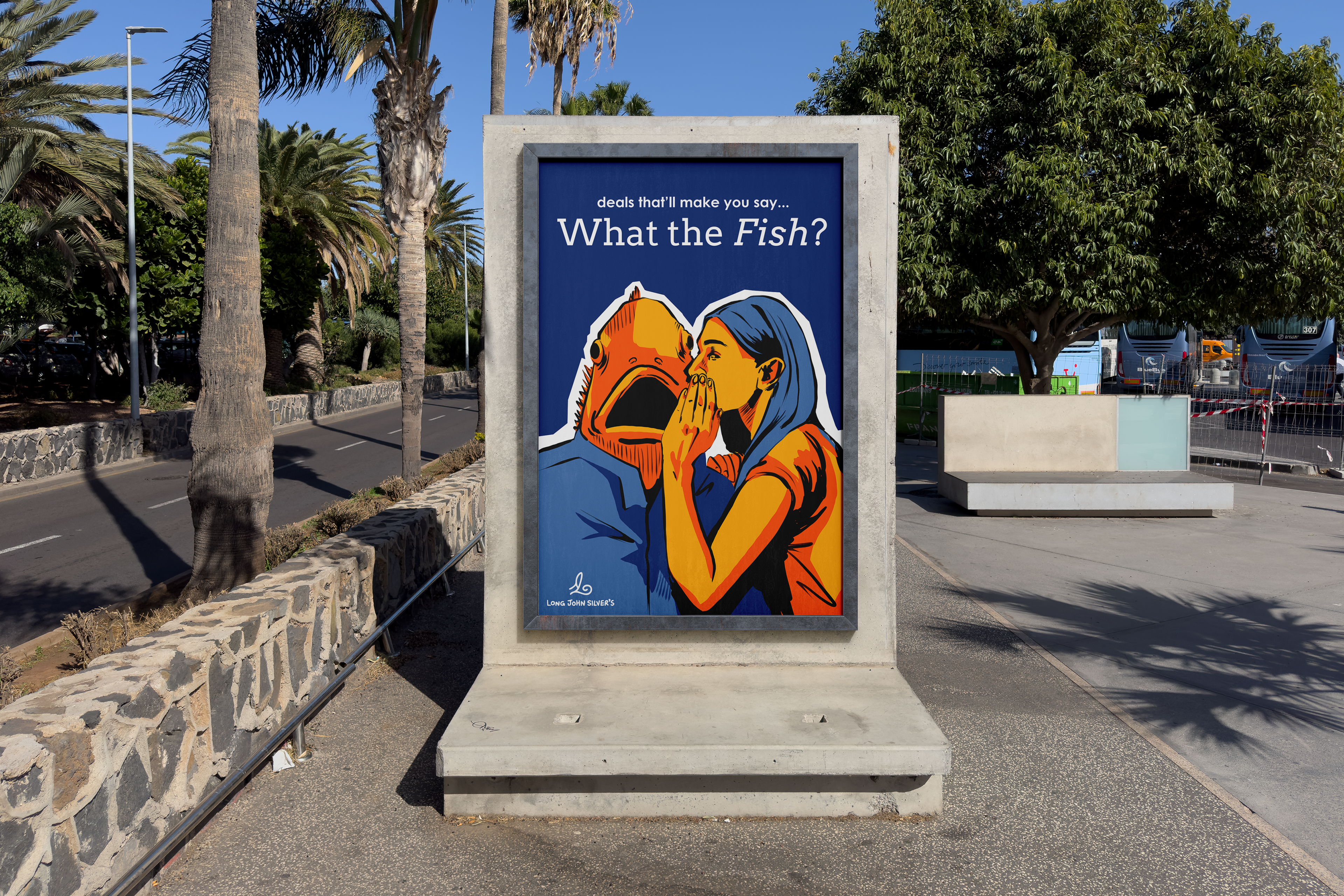
This is a weird public poster advertising the new Long John Silver's. Strange, eye-catching posters are great at getting people’s attention, and that’s what Long John Silver’s needs. I went with my detailed illustration style to make it look more out of place.
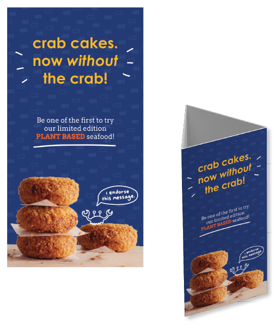
Here’s a photo integration example featuring a promotional menu stand for usage on restaurant tables. Making boring informational signage just a little silly is more engaging to the customer, attracting their attention and enhancing their overall experience.

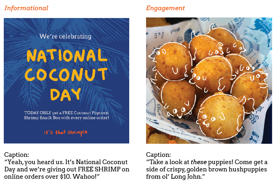
These are some examples of in-brand Instagram posts integrating illustration and photography. The captions extend Long John Silver’s conversational, casual, and funny tone. The style of the left post is meant to inform the viewer of current deals and other necessary information. The right is silly and engaging, reminding the viewer that Long John Silver’s exists without feeling too much like an advertisement.