
WHAT:
This is a potlucking app named 'Who's Hungry?' The app was designed to connect people with their local communities over a shared meal.
I conducted 10+ interviews for this project and most people I asked said that going out to eat with friends was one of their favorite activities and they wished they could do it cheaper and more often. This led me to developing a series of ideas on how to get people more engaged with eachother through food, and ultimately took me here.
WHY:
Orange was chosen as the main color because of its association with food, fun, and optimism. I used the typeface 'Figtree' as a monotype for this app; this typeface was chosen for its uniform line weight pairs well with drawn graphics as well as its food-themed name. I knew I needed a sans-serif typeface for digital display and it fit the bill.
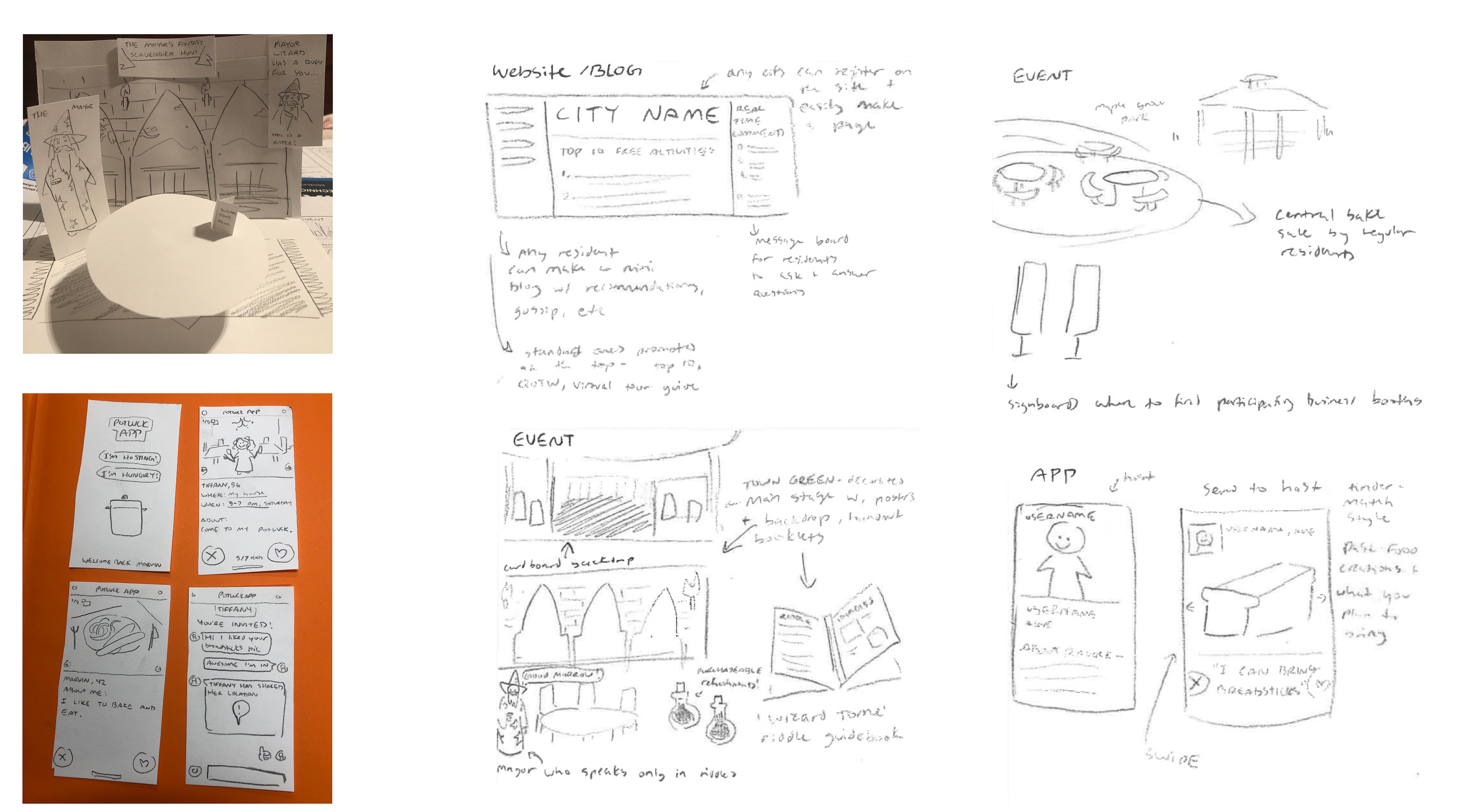
My research and initial project ideation focused on two topics: 1. People are not exploring their cities anymore and 2. People are not connecting with their local communities. These insights emerged from a number of interviews I conducted as well as independent research from online blogs and podcasts. I came up with 30 ideas then refined them down to 4 thorough ideas, and eventually 2 paper-cut prototypes.

I collected visual inspiration pursuing the adjectives of 'collaborative', 'fresh' and 'warm'. I ultimately ended up deciding on the 'warm' moodboard and used this to inspire my visual direction.


Going into the visual execution stage, I knew vaguely what I wanted the app's layout to look like. I experimented with different orange and yellow toned backgrounds, as well as figuring out where I wanted the buttons to go and which functions were necessary to include.
I experimented with a few different symbols for the app's icon bef0re ending up on a little crockpot guy. I also did a few iterations of an oven mitt sock puppet, an anthropomorphized nose, and a curious little simplified character.


The app's icon is a mix between a crockpot and a dutch oven, with its lid popping open to show that it's time for a meal. It has a similar illustration style to the app's buttons and additional graphics. The color is sometimes inverted to orange, depending on the context.
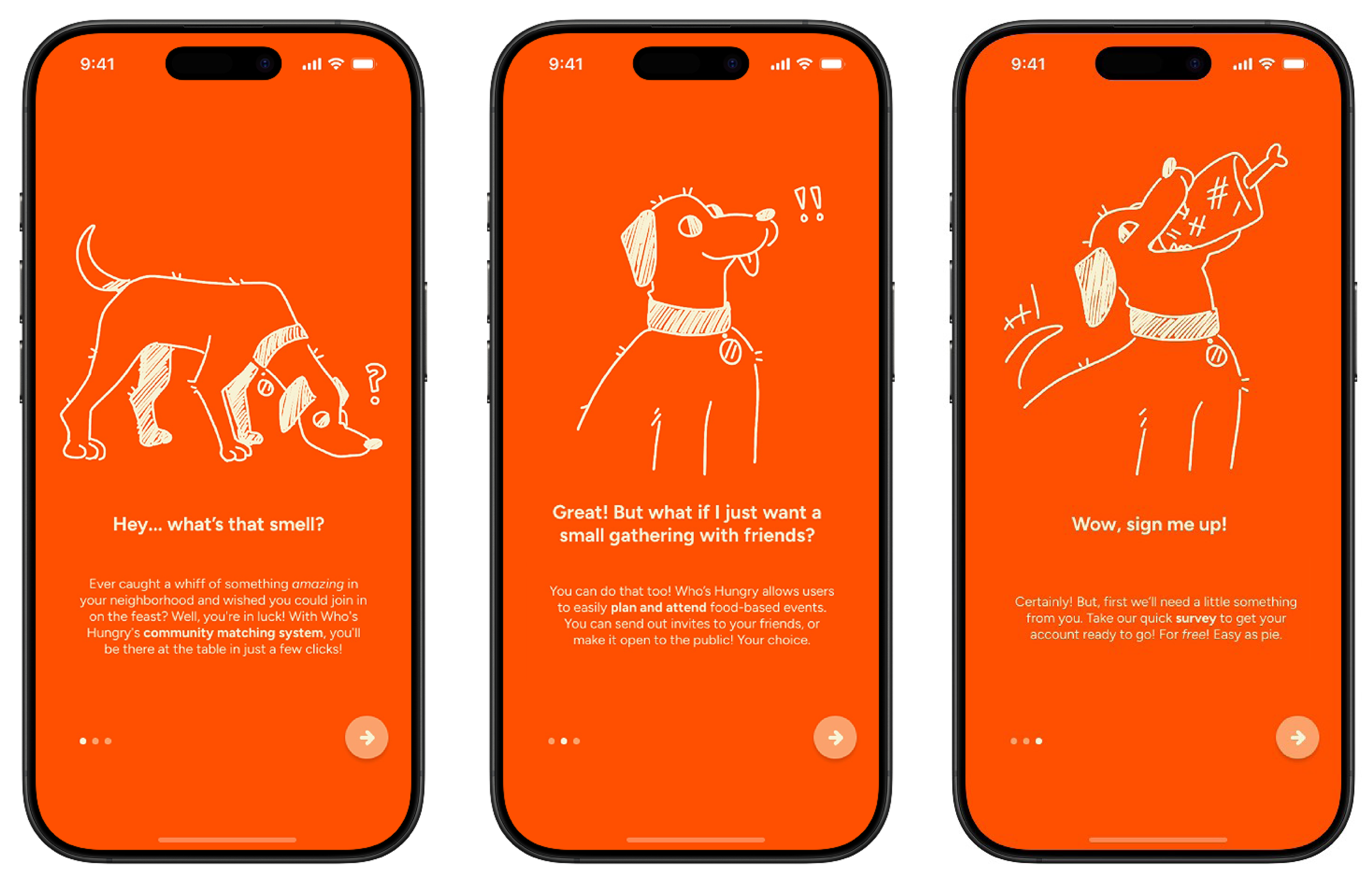
This is the tutorial screen new users see upon opening the app for the first time. The dog narrator explains the app's purpose and functions, prompting users to create their profile.
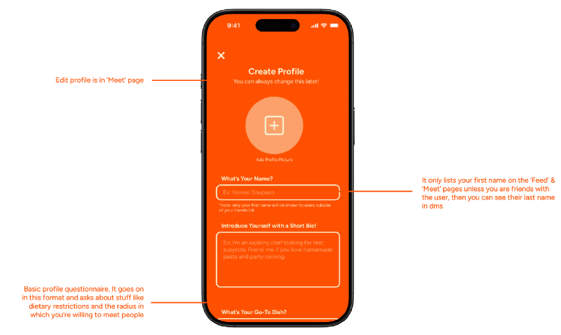
The dog leads you here, where you answer some basic profile questions about yourself and how you want your profile to appear to others. The instructions are full of puns and subtle jokes to set the tone of the app and keep users engaged.
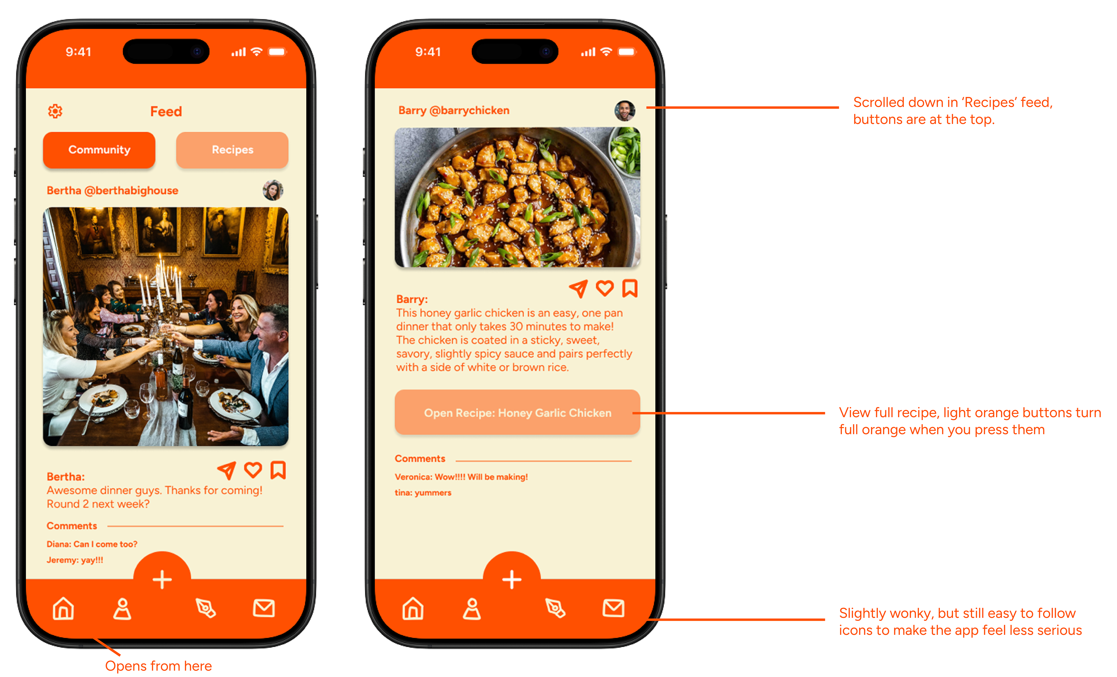
This is the app's homepage, and where registered users will immediately see when they open the app. It's in an infinite scroll format and allows you to see, like, save, and share community posts of recent events and recipe ideas.
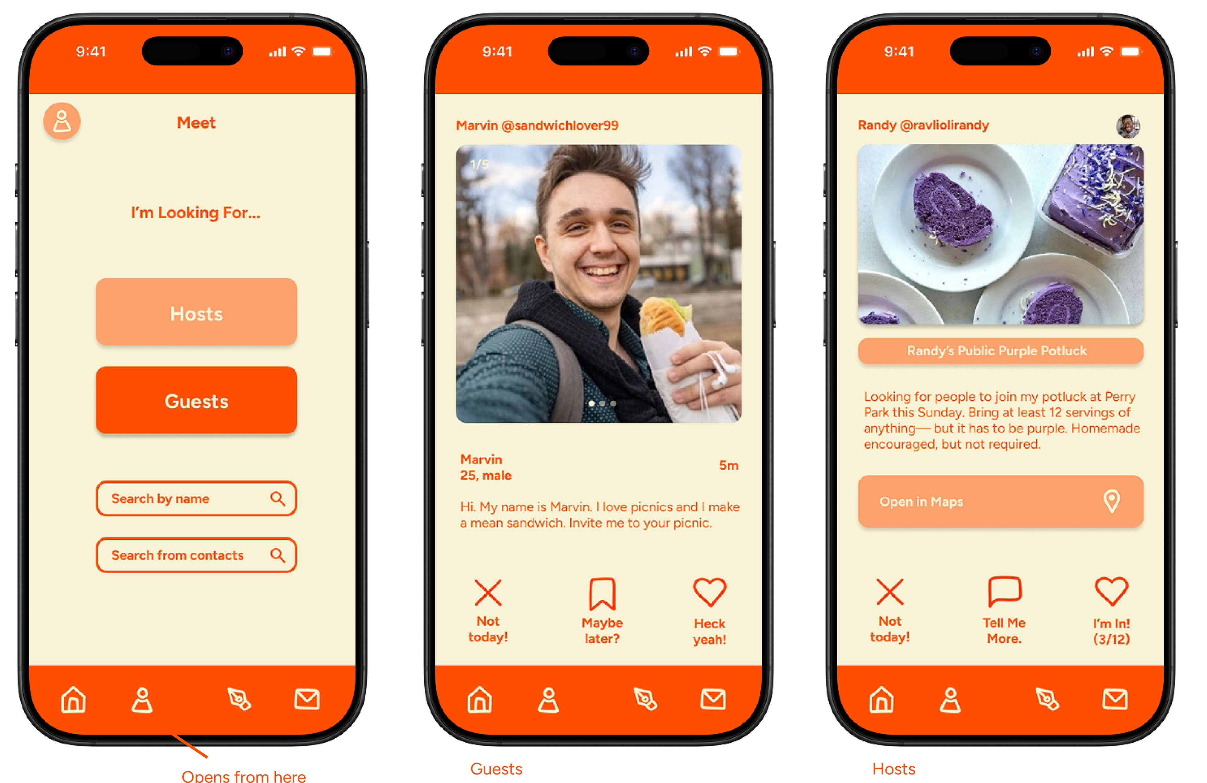
This is the app's function for meeting people. The initial 'Meet' screen allows users to easily find people hosting events and guests for potential events they could host, as well as a search feature for people they already know.
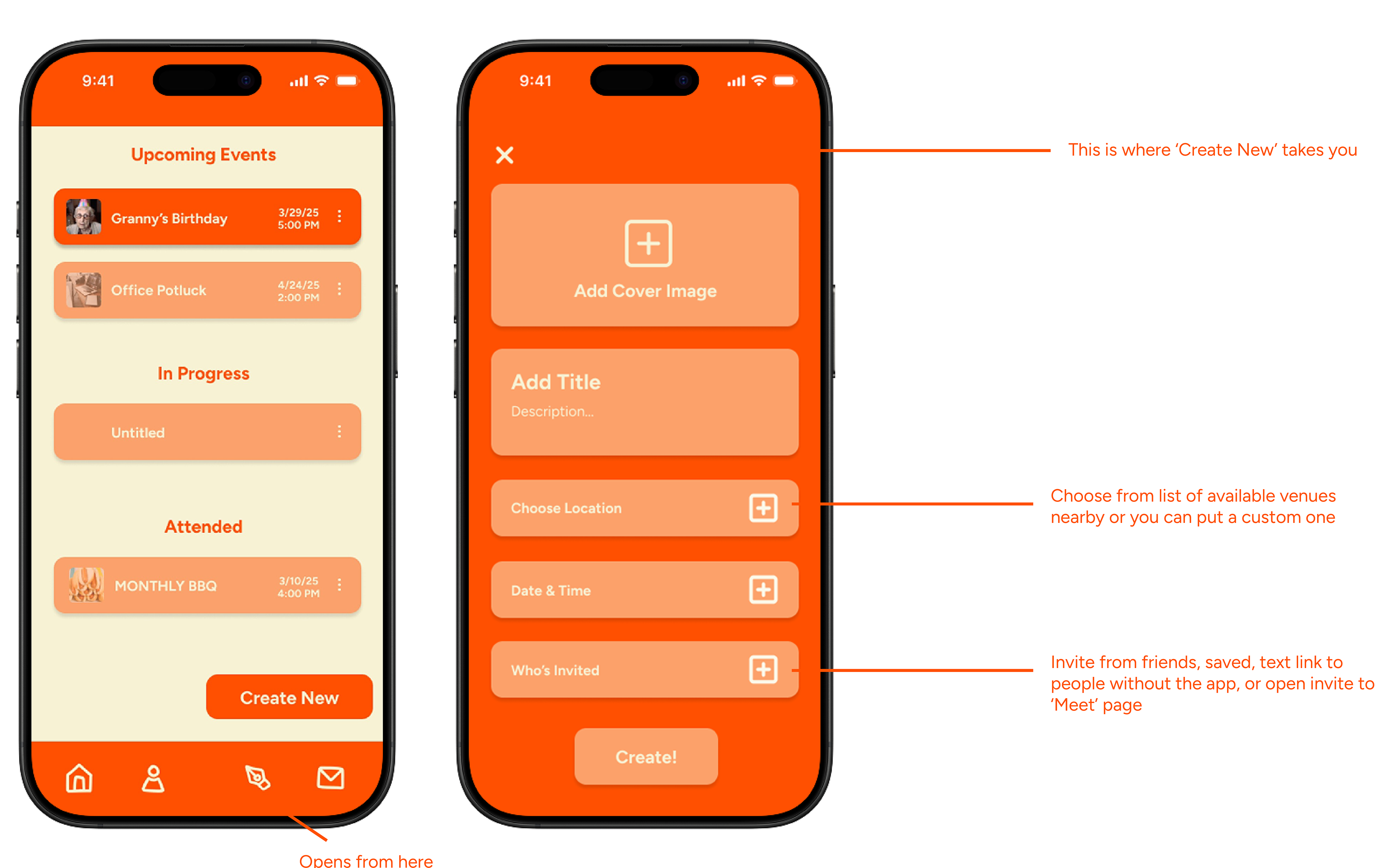
This is the app's event planning function. Users are able to see upcoming events, events they are currently planning and have not yet finished, as well as events they have attended in the past. The 'Create New' button leads them to the screen they use to create events; here, they can add images, add descriptions, choose an event location, choose a time, and send out invites.
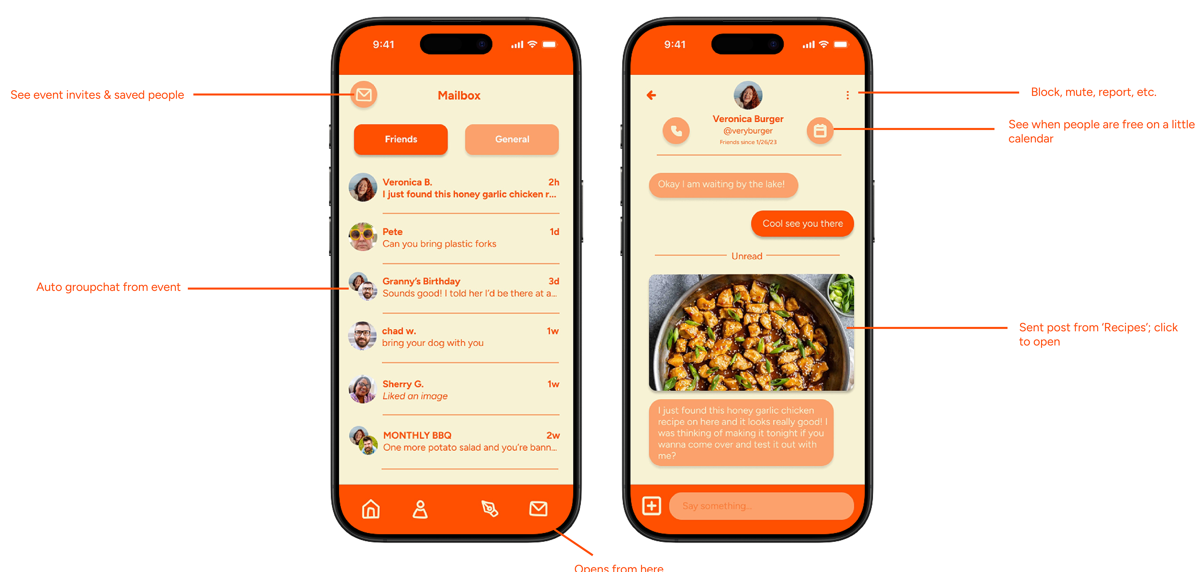
Finally, this is the app's message function, featuring a list of direct messages as well as one opened message. This section of the app includes many different features, including auto-generated groupchats upon creating an event, a voice call button, a calendar to work around people's schedules, and the ability to send posts from your feed.